Reviving a local non-profit's website and branding
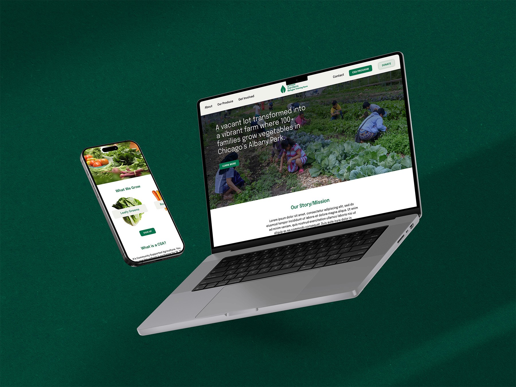
The Global Gardens Refugee Training Farm (GGRTF) website redesign was initiated to address key challenges faced by the farm in enhancing its online presence, driving donations, and increasing engagement with its Community Supported Agriculture (CSA) program. The redesigned website aimed to streamline user experience, strengthen the farm’s visual brand, and make it easier for users to find information and support the farm’s mission.
Timeline
4 weeks
Industry
Non-Profit
Platform
Web
Year
2023
Stack


Scope
Research, Web Design, UI, Visual Identity
About the Project
Garden Refugee Training Farm is a non-profit farm and garden that was started in 2012 by 42 refugee families from Burma and Bhutan. Now operated by over 100 refugee families, the farm generates over 7,500 pounds of produce, which helps support and feed their families. The farm's mission is to improve access to fresh vegetables for newly arrived refugee families and their urban neighbors, allow displaced farmers to reconnect with the soil, and foster new, refugee-operated farms.
Problem
Firstly, the team has limited resources making it difficult to update and maintain the website. Currently, Farm Manager, Haley, single-handedly manages the site and needs an efficient and easy way to update and maintain it.
The site didn't effectively support the farm’s goals of driving donations, sign-ups for the Community Supported Agriculture (CSA) program, and increase brand awareness.
The website’s complex navigation, outdated content, and lack of a coherent visual brand made it difficult for users to engage with the farm’s offerings. Additionally, the site’s poor accessibility further alienated potential supporters.
Solution
Building trust and improving accessibility within the constraints of the current web-hosting platform, Weebly, were the primary focus of this website redesign.
I supposed meeting the GGRTF's goals by improving the website's information architecture to ensure seamless and intuitive navigation, redesigning the organization's visual identity to increase brand presence and awareness, and improving accessibility standards to meet WCAG compliance.
After reviewing user feedback and indirect competitors' digital presence, there are a few clear goals that can solve for user pain points and align with stakeholder requirements, including: Increase visibility and accessibility of donation options; simplify navigation and content structure to improve user experience and enhance the website’s visual branding to reflect the farm’s values and build trust.
Information Architecture
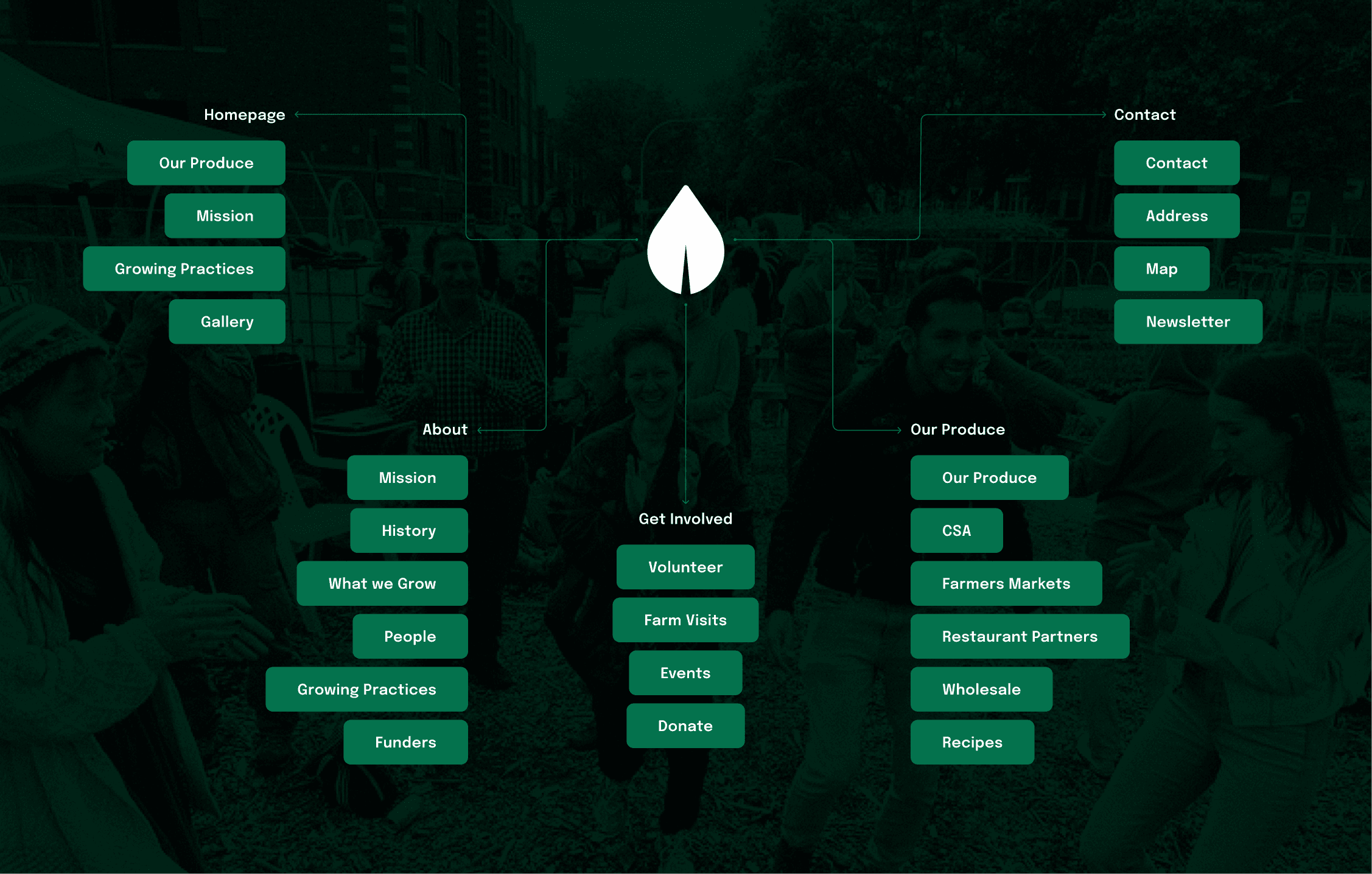
The website contained a lot of information that stakeholders wanted to keep, in addition to new content that they wanted to include such as recipes. Additionally, users suggested content and information they would like to see on the website, such as impact data and reports, that would help build trust with the organization. This meant that the content needed to be meticulously organized to meet those needs while keeping the navigation simple enough to avoid overwhelm. Ultimately, following a card sorting exercise, I organized website into five main pages: Homepage, About, Our Produce, Get Involved, and Contact.
Visual Identity
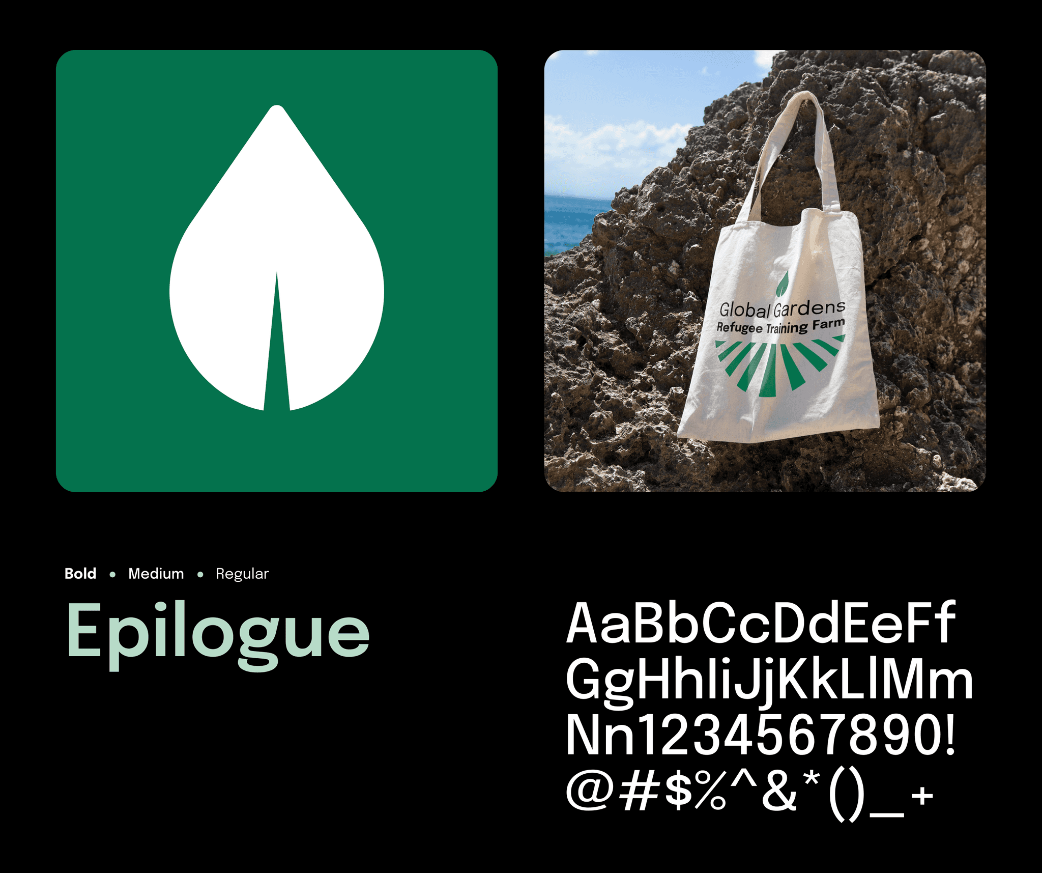
GGRTF did not have a defined visual brand identity which resulted in their powerful story and impact to get lost in the sauce. It was important to develop a foundational visual identity that they could continue to develop and establish more trust with their users and a stronger presence in the community.
Epilogue is a versatile sans-serif font created by ETC. Type. It is a clean and crisp go-to font that is familiar, making it comforting and easy to use but unique enough to be memorable. The range of weights makes it easy to accommodate any size requirement, on screen and in print. It is an Open License Font that is free to install on as many devices and use on any platform needed making it a perfect fit for a non-profit.
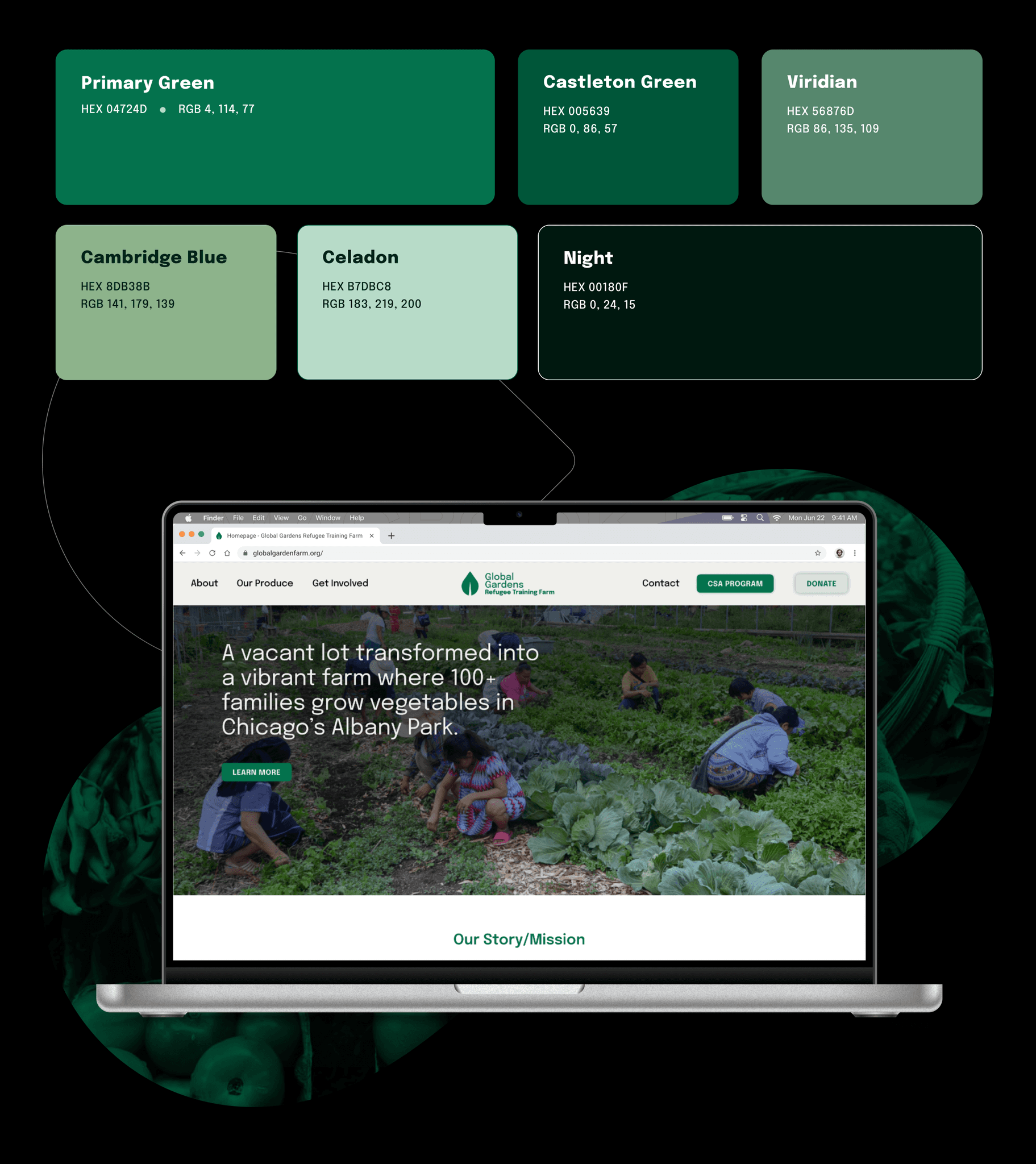
Based on survey results, users favored natural colors and earth tones, particularly green tones. Green can represent growth, harmony, fertility, and freshness. It's often associated with renewal, new beginnings and rebirth and can improve mood. Green can also evoke feelings of vitality, peace, and revival.
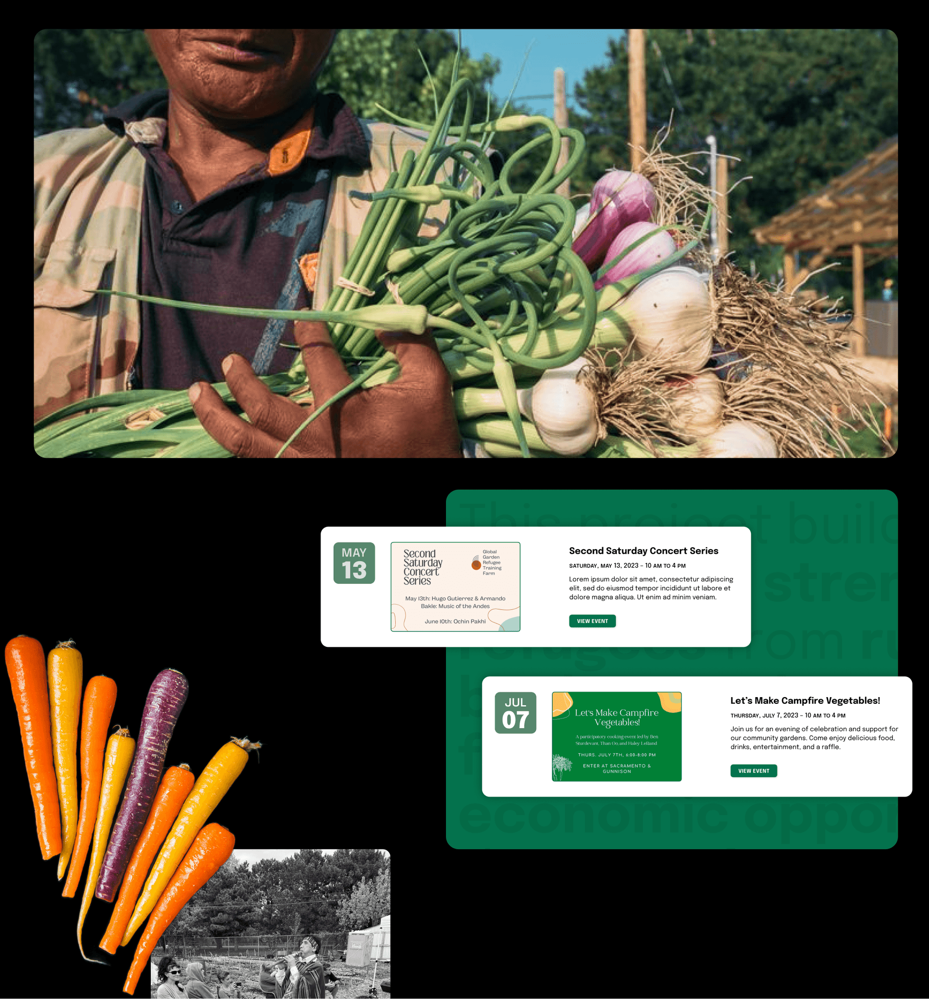
The updated visual branding, which includes consistent use of colors and thoughtful photography, now reflects the farm's mission and values, helping to build trust and connect with users on a more personal level. Photography is a highly important asset for GGRTF to build trust and foster community. It is important to show users and potential volunteers, donors and others, who they're supporting. Images, in a digital world, remind us that we are interacting with and affecting human lives.
Accessibility
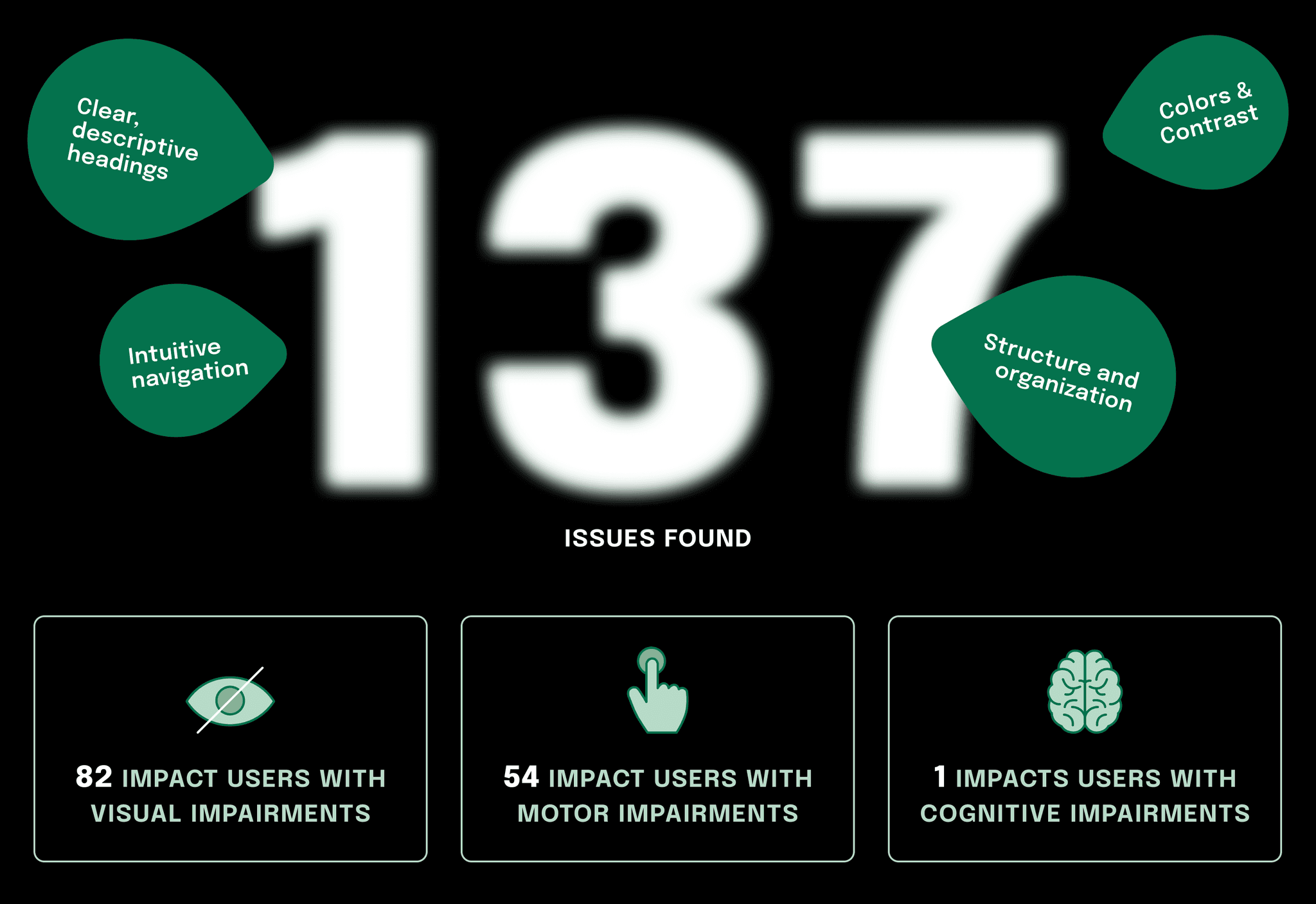
Accessibility was top-of-mind when working on UI. Addressing accessibility issues was paramount. The original site had several accessibility flaws that could alienate users with disabilities. Improvements such as better color contrast, use of alt text for images, aria labels and consistent text sizes have made the site more inclusive, aligning with web accessibility standards and broadening the farm’s audience.
Delightful and intuitive
The redesign process revealed significant insights about the GGRTF's audience, emphasizing the need for a simplified user experience. The original site's complex navigation and overwhelming content were major barriers to user engagement. By streamlining the site structure and reducing the number of pages, we made it easier for users to find information and interact with the website, aligning with our research that showed a preference for less clutter and more intuitive navigation.
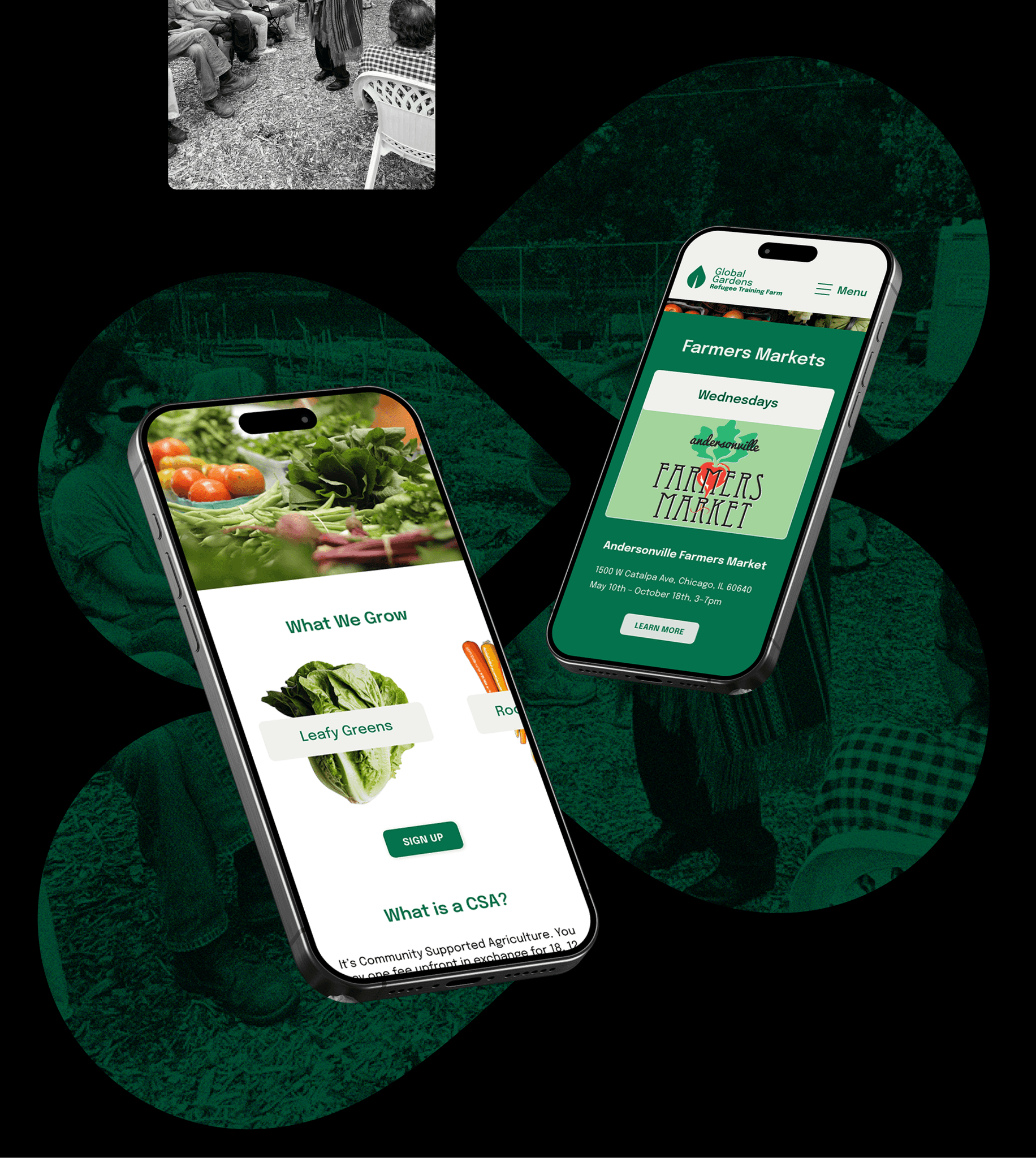
One of the most significant impacts of the redesign was on the visibility of the CSA program, which are crucial for the financial sustainability of the farm. Enhanced content strategy and UI design now effectively highlight these programs, inviting more community involvement and support.
Future Considerations
Looking ahead, the website will require ongoing updates to ensure content remains relevant and the user experience continues to meet the needs of GGRTF's current and prospective donors and supporters. Regular testing and feedback will be crucial in iterating the design, particularly in refining the donation and volunteer sign-up processes to further ease user interactions.
Also, the visual identity could be expanded and guidelines standardized for a cohesive presence and future use-cases.
Additionally, considering the importance of mobile responsiveness highlighted by competitor analysis, continuing to optimize the website for various devices will be a priority. This will ensure that users can interact with GGRTF conveniently, whether at home or on the go.
